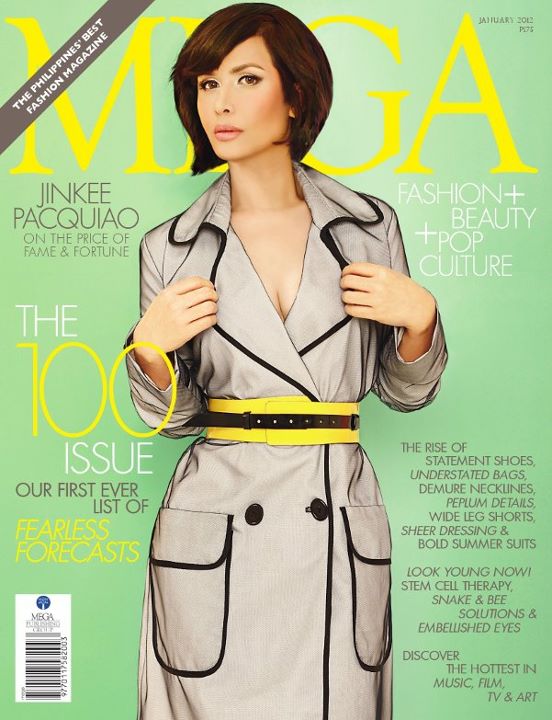
Thoughts on Jinkee Pacquiao’s January 2012 cover on Mega Magazine
People on Twitter are ranting that Jinkee’s cover is ‘shopped so heavily that it doesn’t even look like her. It’s true, it’s Photoshopped to the nines, but not in the way of drastically altering her face. I mean, the woman is naturally pretty and is even looking better these days. Gorgeous makeup and strategic posing can go a long way in making a person look different on camera you know!

I do think they sharpened her jawline and lengthened her neck a little bit, but that’s it for changing her appearance. What annoys me most about the cover photo is how airbrushed and fake it looks. Why did they have to make it look like her skin is painted on when it already looks fine? Yeah Jinkee has some rough pores and maybe a couple of pimples but that can be softened without having the whole thing look too unrealistic.
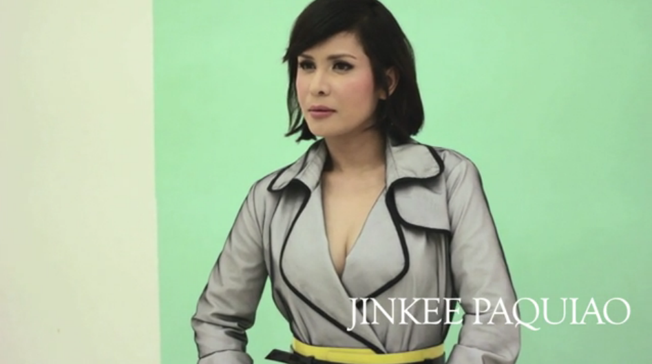
Mega posted a behind-the-scenes video of the cover shoot last night, but it appears that the video has been taken down. Haha. Good thing I managed to take some screencaps last night! It's now back up! Watch it.


I just wish that magazines didn't have to go to absurd lengths just to “perfect” a photo. Us normal women know when were being gypped. We still have a firm grasp of reality. It’s an affront to our intelligence to have a beautiful woman look like she needs so much help, her face had to be erased then drawn back on.

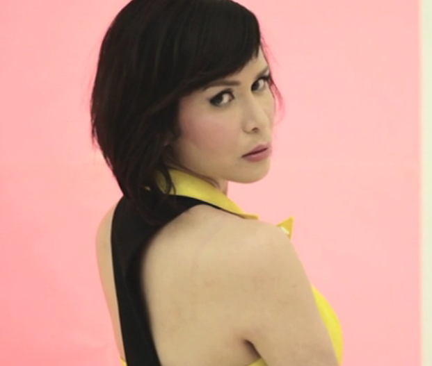
Jinkee in another outfit for the shoot. Why bother with Photoshop, really.
What’s your two cents on Jinkee’s Mega cover?
PS Didn't talk about Charice Pempengco's Preview January cover because it's a non-issue. That's not much Photoshop, people, it's just brilliant styling and makeup.

