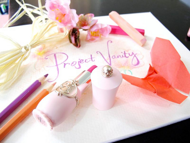
New blog look for 2013!
It's been a while since I tweaked the design of my website. Can't explain why I did it now, of all possible times - just felt an itch I guess! I want a fresher, lighter look for 2013. At first I thought of using this photographed set up, but it didn't feel right for the header so I just cut a piece off it.

It would have been so cool if it worked out! I was inspired by how Dave McKean created his Sandman covers. Mine is nowhere near the complexity and artistry of what he did of course, but I do like the idea of creating my header by hand instead of using Photoshop.

Hope you like the "new" look of Project Vanity. :)
